How did I pick the most hated new features of the year? Well, I didn’t pick them; you did. While looking at the most popular posts on here’s the thing this year, I saw that many of them had to do with tweaks, changes, redesigns, or all-new features that you wish had never happened.
In some cases, there were workarounds; in others, chagrined company executives hit the brakes and reversed course. A few, though, we’ll just have to live with—for now, anyway.
So, in ascending order of most hated tech improvements, let’s begin with…
#5: Facebook’s revamped News Feed, and the new “ticker”
How it used to be: A live feed of posts, photos, and status updates from our friends, neighbors, and loved ones on Facebook. You could sort the old feed chronologically, or filter the updates according to your Friend Lists. Easy.
What they changed: In September, Facebook rolled out two major new features: “Top” and “Highlighted” News Feed stories that the social geniuses at Facebook figured mattered to you the most—whether you thought so or not—and the “Ticker,” a live feed in the top-right corner of the screen that reported your every move, no matter how insignificant.
Why you hated it: The live Ticker felt a little too much like an eye in the sky, and there wasn’t (and still isn’t) a way to hide it. The new News Feed, meanwhile, wouldn’t let you sort updates from friends in chronological order anymore; instead, you were stuck with “Highlighted” updates that were often hours or even days old.
Status: The Facebook Ticker is still there, telling the world every time you “like” something or hit “play” on Spotify. But while “Highlighted” updates are still around, at least you can now sort the News Feed chronologically again.
#4: Netflix website redesign
How it used to be: It’s hard to remember now, but earlier this year, Netflix’s home page featured a fairly standard grid of smallish, clickable rows of movie cover art, as well as long listings of videos that you could sort by year, MPAA ratings, or (best of all) user “star” rating.
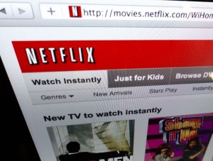
What they changed: In June, Netflix unveiled a major home-page revamp, complete with large, slowly scrolling rows of “Watch Instantly” movies and TV shows.
Why you hated it: The slow, stately pace of the scrolling video covers drove many of you nuts, as well as the fact that you had to hover over a box with your mouse to read the video details. Also annoying: the fact that the redesign seemed to kick DVDs to the curb in favor of instant-streaming movies. Worst of all, though, you couldn’t sort videos at all anymore—or at least, not on the Netflix website.
Status: Netflix hasn’t budged on the scrolling video boxes, but you can once again sort movies and TV shows by year and rating.
#3: Mac OS X “Lion” and the missing scroll bars
How it used to be: Back in the day, the windows on our desktops used to have these little bars on the edges that you could click and drag for scrolling—you know, scroll bars. Indeed, those handy scroll bars are still standard issue on Windows PCs.
What they changed: With its big “Lion” update for the Mac operating system, Apple decided to take several features from the iPhone and iPad and bring them “back to the Mac”—including the near absence of scroll bars, which only appear as slivers while you’re actually scrolling.
Why you hated it: While many have grown to love scrolling with two-finger gestures on their trackpads, plenty of Mac users—and particularly those who do precision editing in programs like Photoshop—missed the visible, easy-to-click scroll bars, not to mention the arrows that used to sit on either end.
Status: You can turn scroll bars back on in the Mac system settings, but they’re still awfully slim and tough to grab. And those scroll bar arrows, by the way, are history.
#2: The new iOS “Newsstand”
How it used to be: Newspaper and magazine apps for the iPhone and iPad have been around for years now, and they used to function just like any other app. You could put them on any home page, put them all in a folder, put magazines in one folder and newspapers in another, whatever you wanted.
What they changed: Enter “Newsstand,” a new feature in iOS 5 that organizes all of your newspapers and magazine apps—well, many of them, anyway—into a single folder, complete with automatic updates whenever a new digital issue gets published.
Why you hated it: Not only can you not hide Newstand into a folder, you also can’t put magazine and newspaper apps into Newsstand unless they’ve been Newsstand-enabled by individual publishers—and in some cases, publishers have specifically decided to keep their apps out of the Newsstand due to Apple’s revenue-sharing terms.
Status: Apple hasn’t budged on Newsstand—well, not yet.
…and, drumroll please…
#1: The Gmail redesign
How it used to be: The old Gmail wasn’t anything special, really—just a standard, unexceptional green-and-white design that millions of users knew inside and out.
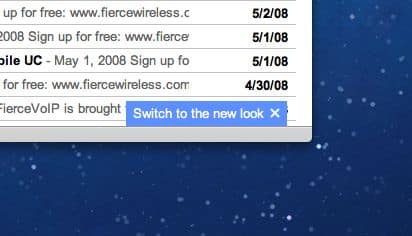
What they changed: Google is in the process of revamping all its web-based services with a boxy, modern-looking black-and-white design, complete with a big black bar at the top and new icons—and Gmail is next in line.
Why you hated it: Your comments pretty much tell the whole story, ranging from “too annoying” and “not user functional” to “cumbersome” and a good old-fashioned “I HATE IT.”
Status: You can go back to the old Gmail look temporarily, but all Google users will have to switch to the new Gmail eventuall—or at least, that’s the current policy.


Trackbacks/Pingbacks