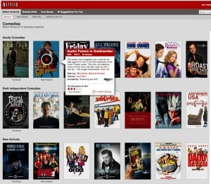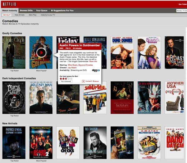
The redesign, which appears to apply only to Netflix’s “Watch Instantly” titles, replaces the clickable rows of smallish box covers with larger icons that slowly scroll when you hover your cursor near the edge of the page.
The usual star ratings are now hidden—that is, until you hold the cursor over a particular title, which spawns a small pop-up window with the movie and/or TV show description, details, plus the previously missing stars.
Drawing the most ire, however, is the fact that you can no longer sort “Watch Instantly” titles by year, MPAA rating, or star rating—a feature that used to be one of the best ways to pick a video from Netflix’s growing streaming collection.
Update: Want to re-enabled sorting for instant Netflix videos? Here’s how to do it.
In a post on the official company blog, Netflix Director of Product Management Michael Spiegelman wrote that the redesign “provides more focus on the TV shows and movies streaming from Netflix,” and that the new “look and feel” will “make it easier for you to find something to watch instantly.”
The steadily growing number of annoyed users who commented on Spiegelman’s post were having none of it, however:
It’s a horrible design. Flat-out awful. This is one of those design changes that’s going to be talked about on the tech-review sites later today, and not in a good way.
…wrote one user. Another:
Please, please, please go back to the old website version. It takes way too long to find something to watch now. We need titles and ratings viewable without mouse hover, and the horizontal scroll takes FOREVER.
…and another:
You’ve managed to make your layout look sleeker and operate far clunkier. This would be laughably bad, except for the fact that I’m paying for it.
While the redesign wasn’t without its defenders…
I like the new interface. No more click click click – just hover to scroll and see program information. You only need to click when you actually want to watch something, add it to your queue or change genres. Big improvement.
…the vast majority of the 80-odd (and rapidly growing) comments on the Netflix blog were of the “this is the worst change to the site since the last one” variety. [Update: There were close to 1,000 comments on the post by Thursday morning, most of them quite testy.]
So, you Netflix users out there, what do you think of the redesign? Love it? Hate it? Cast your vote in the comments below.


Yo Ben, Netflix being a very data-driven company I’d be surprised if they didn’t user test this to the gills…but then again just because they put a lot of analysis an algorithmic prowess to work to make movie/video recommendations, that doesn’t mean they necessarily put the same discipline to work testing the usability of the website. Simple but important usability tools like “sort” might be getting lost in the allure of super smart recommendations and “modern” page display capabilities.
Yep, a surprising move—I had to triple-check to make sure I wasn’t missing something. Worth noting that you can still sort DVD listings…for now, at least.
The inability to sort by year is a huge omission. Netflix is full of super old crap nobody cares about, and now that super old crap nobody cares about is intermittently sparsed between what few good movies are available for streaming. And the comment about paying for this is a great point. When Facebook makes a UX change, so be it. But I’m paying for Netflix.
Agreed—although for me, the ability to sort by star rating was the biggest loss in the redesign.